Barbaricum
artistic direction – editorial direction – illustration – graphic design
Barbaricum
Vol. I – Democracy
Date
– 2020
Client
– Okoni
Role
– artistic direction
– illustration
– graphic design
– editorial direction
– editorial design
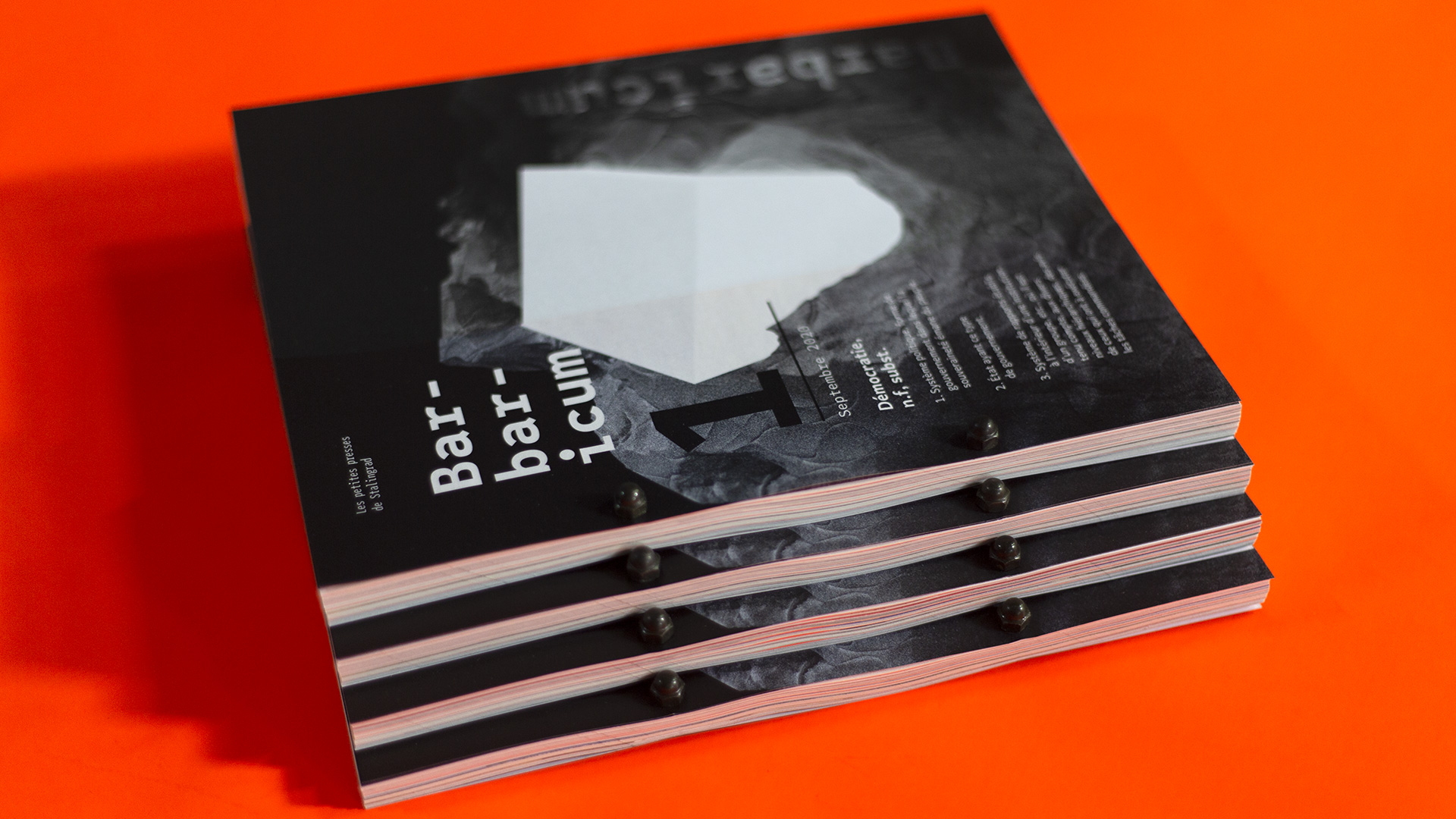
Barbaricum is the result of a year of work by the entire Okoni agency’s team. I had the chance both to take part as a contributor, but also to lead and develop all the thinking around design and editorial direction and artistic direction.
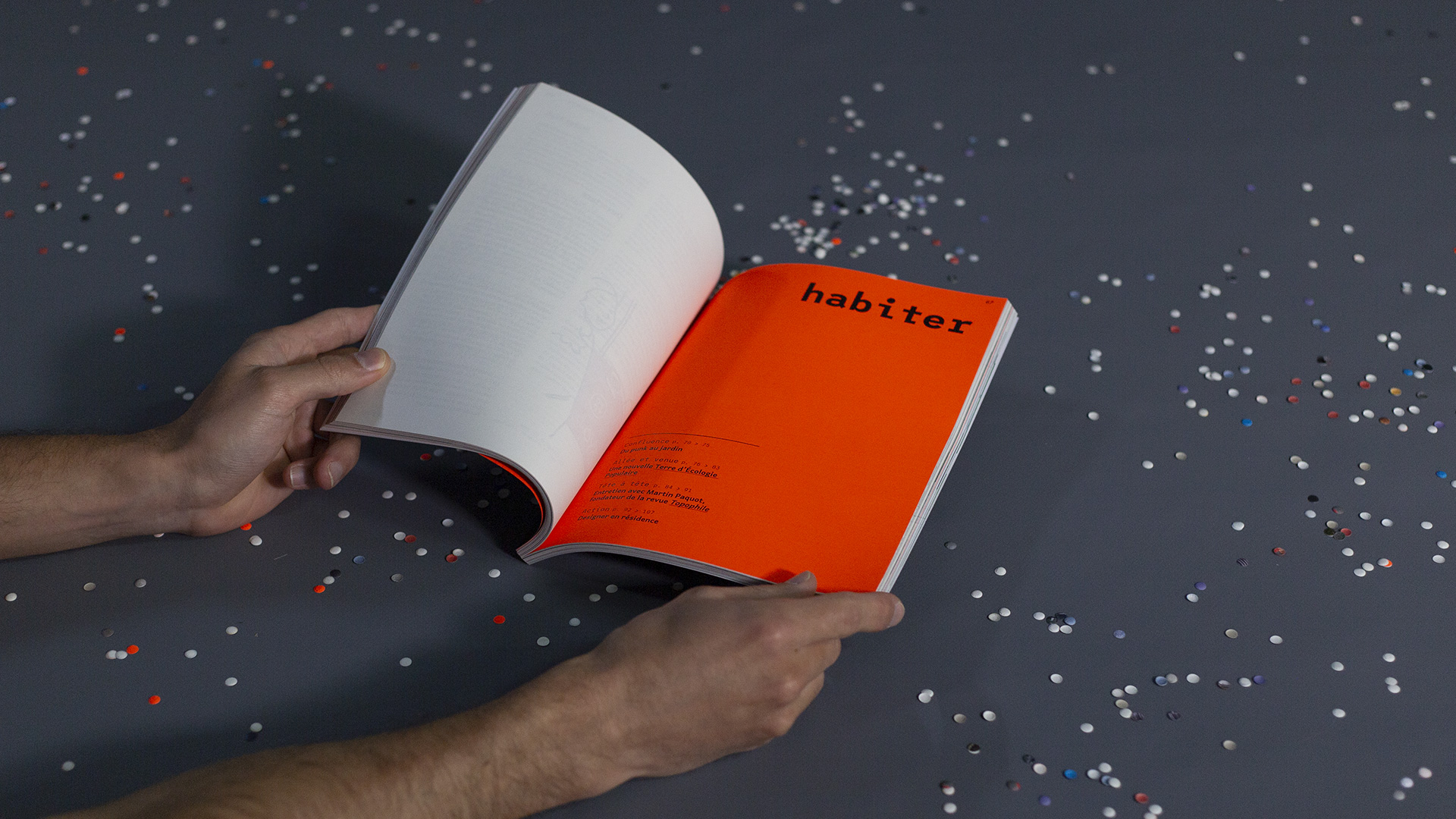
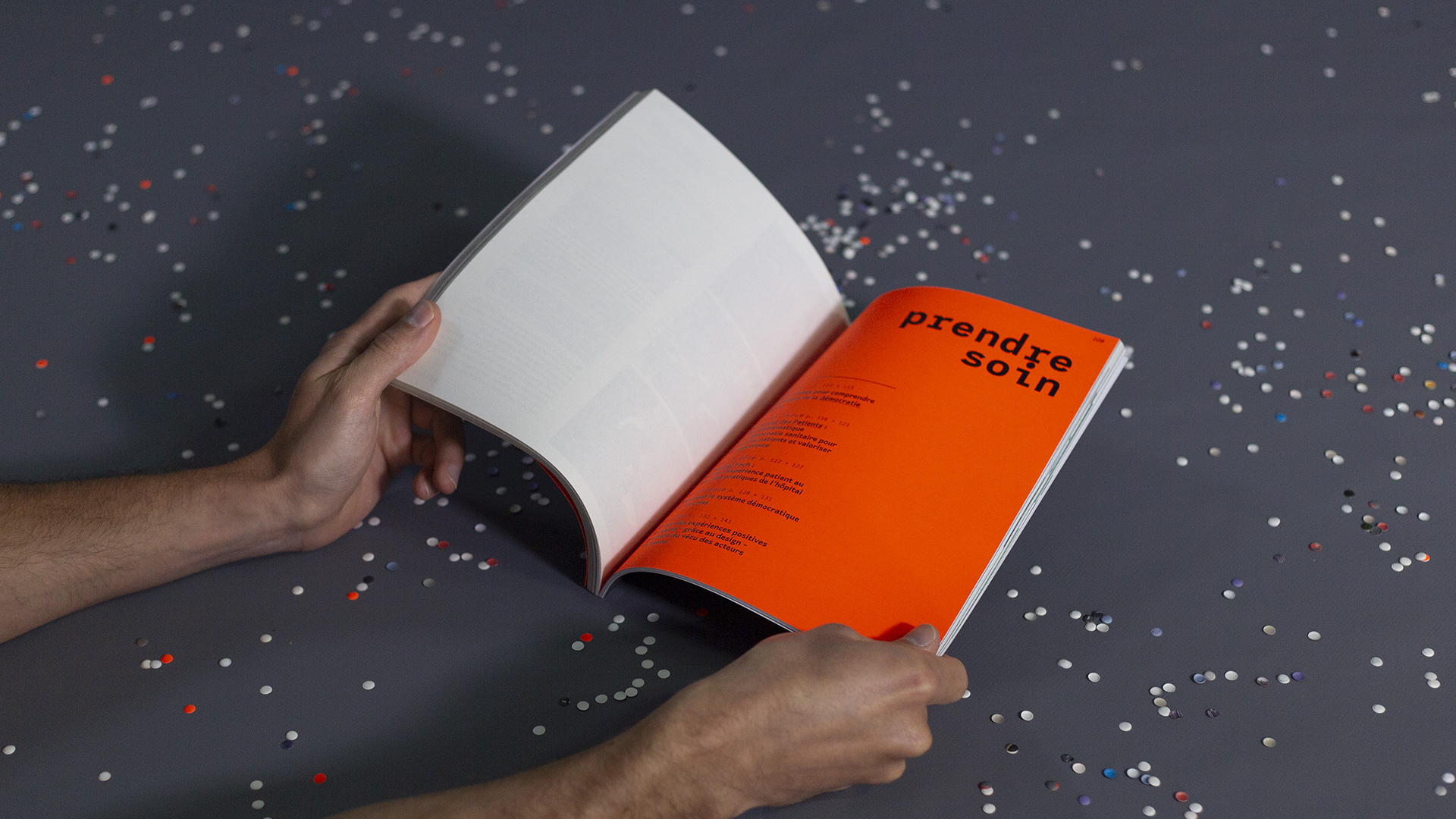
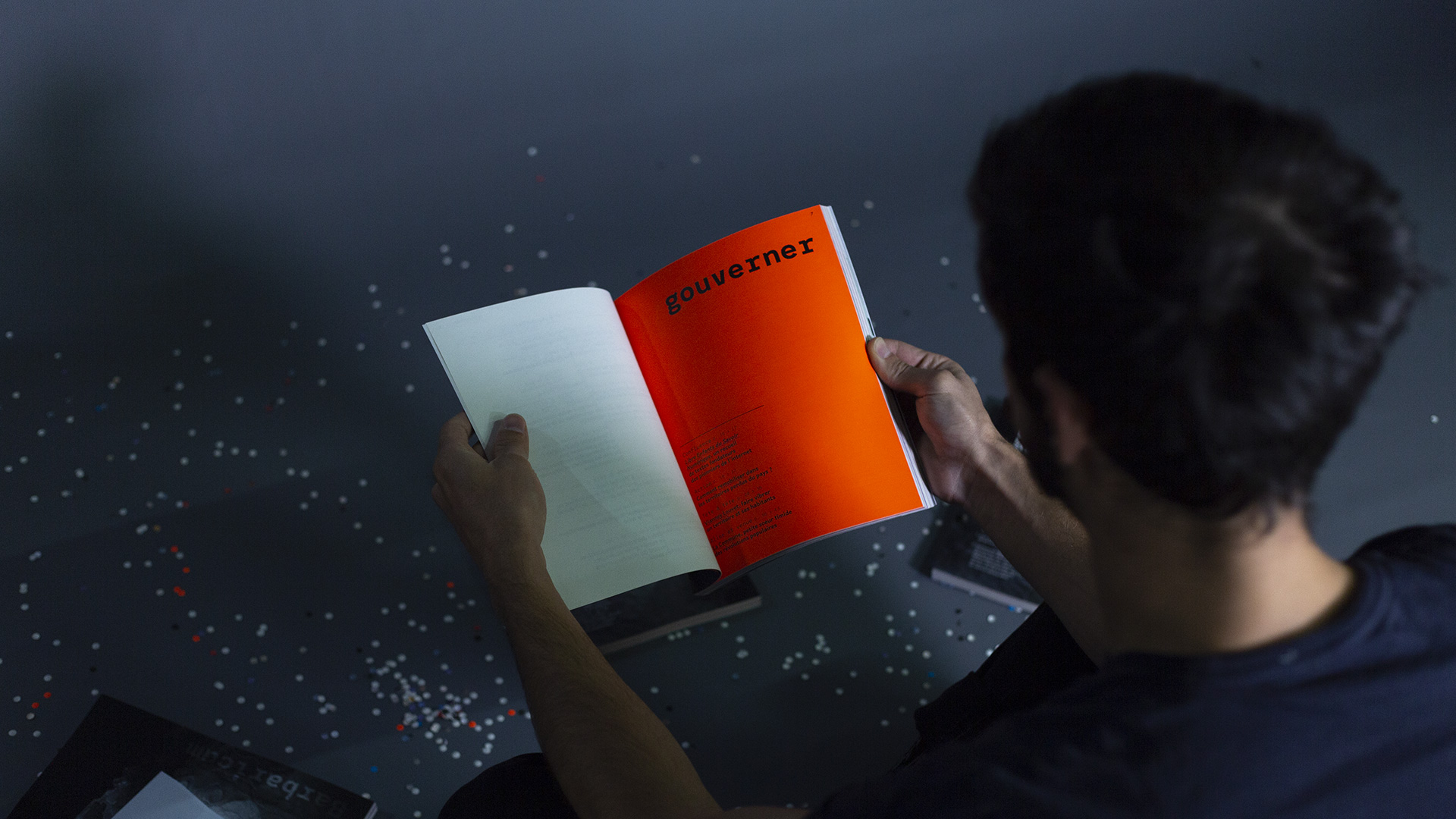
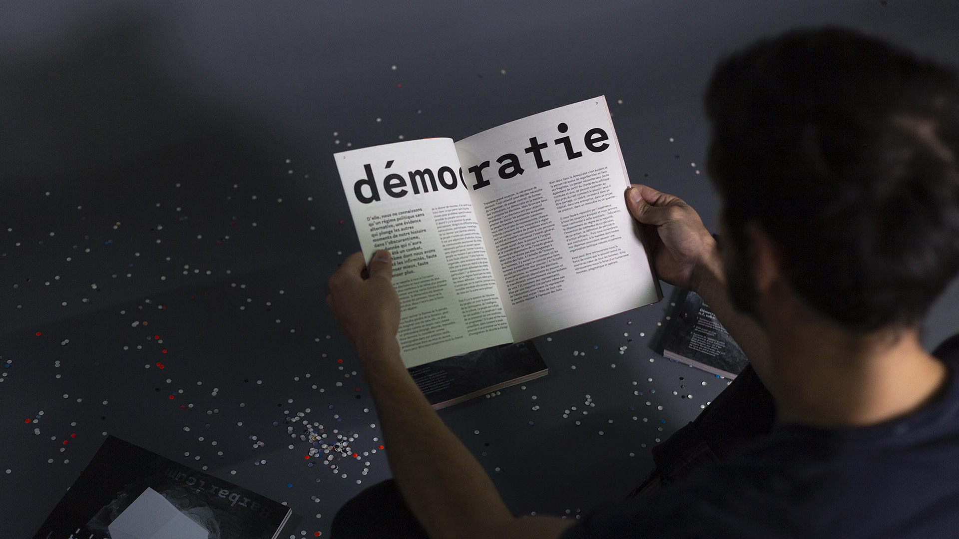
Okoni is organized by territories that embrace everyday life: inhabit, rejuvenate, govern, take care. Each person on the team, depending on their home territory, had to grasp the theme of democracy in order to produce a visual and textual search. Why this theme? Because it worries us and mobilizes us in each of our approaches.
We read, interviewed, exchanged, gathered the stories of our work which could shed light on the subject. It was a long process of learning and research, which takes shape in an unstable, fragile body of work, but full of hope and energy.
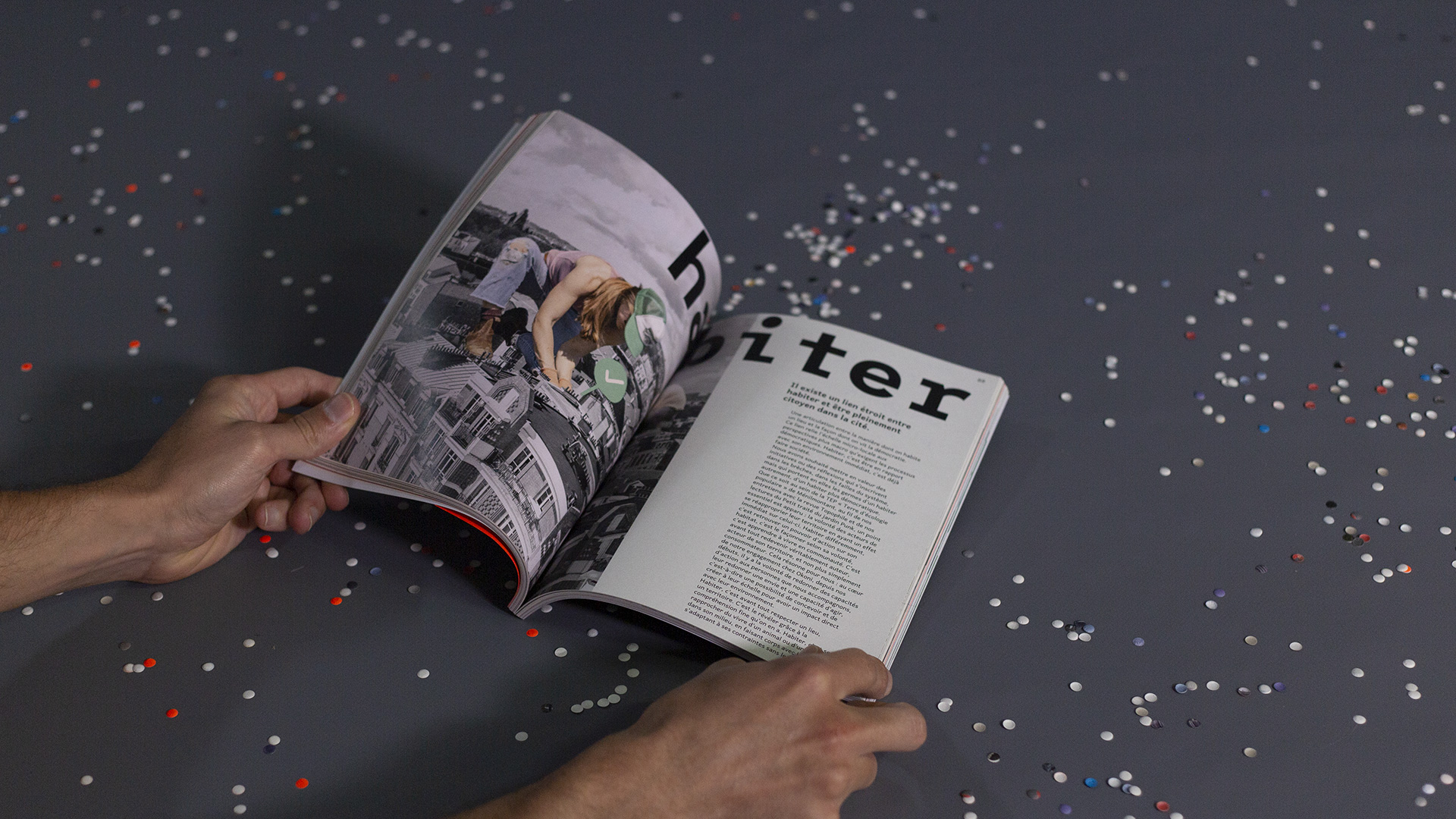
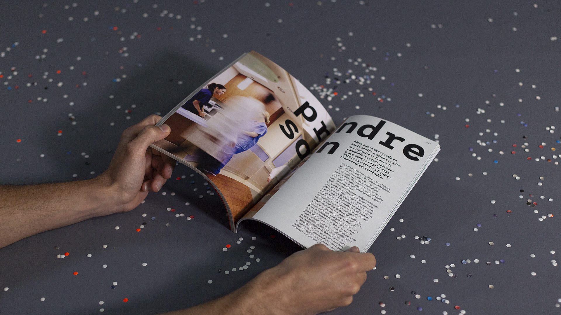
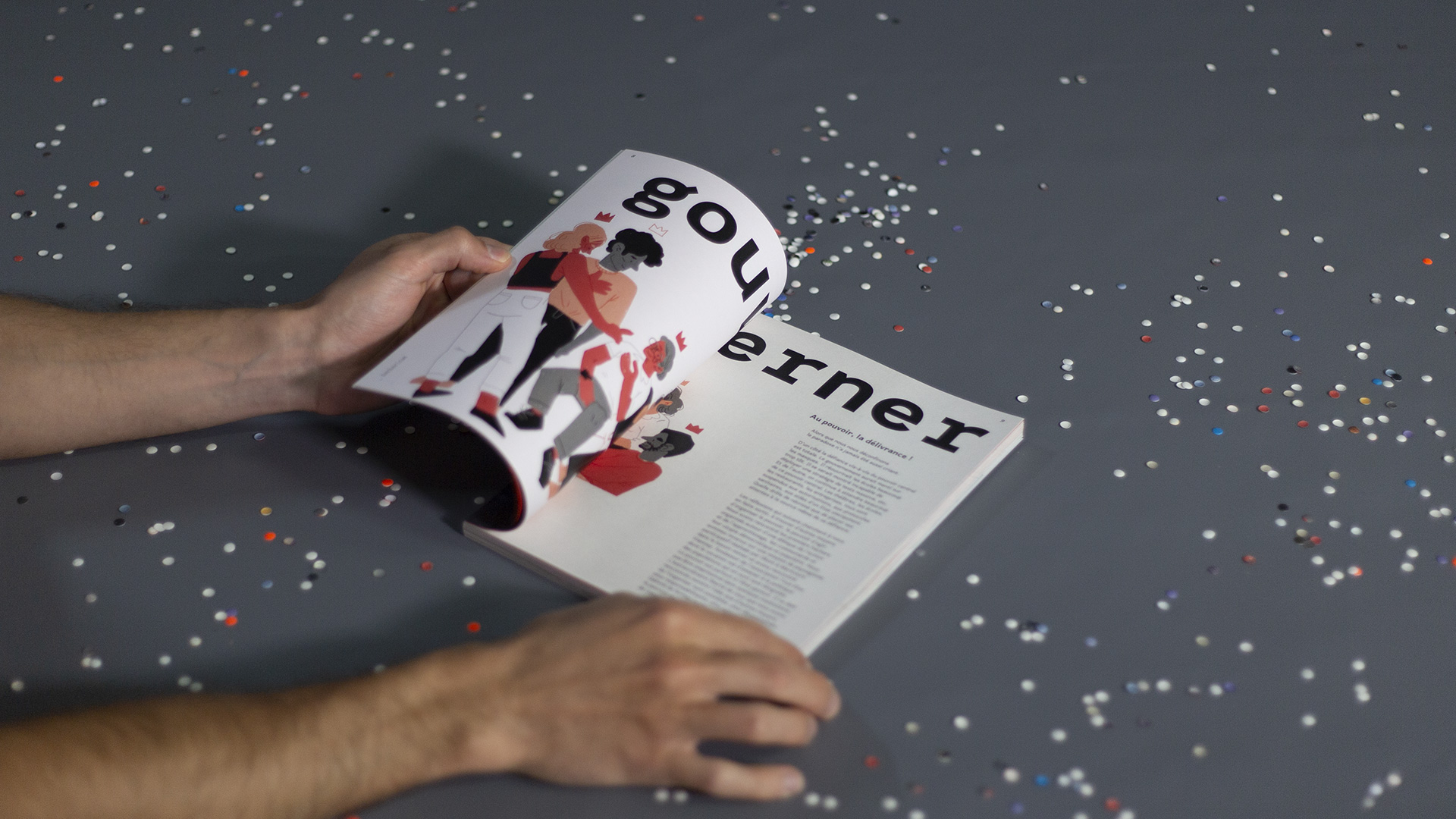
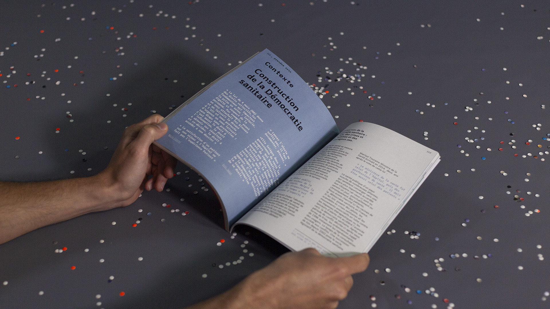
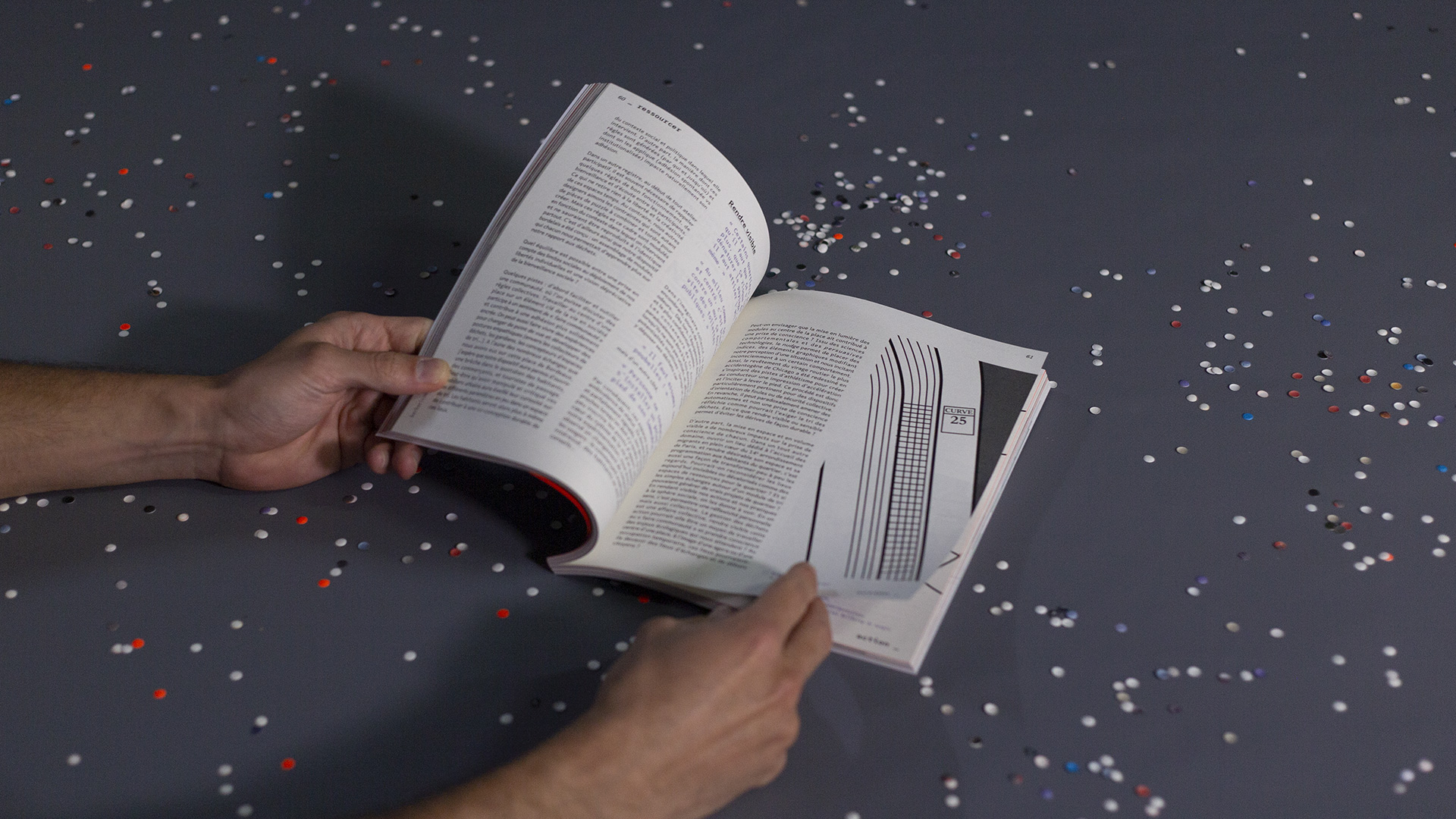
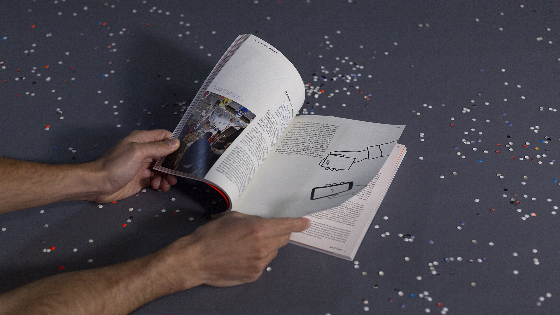
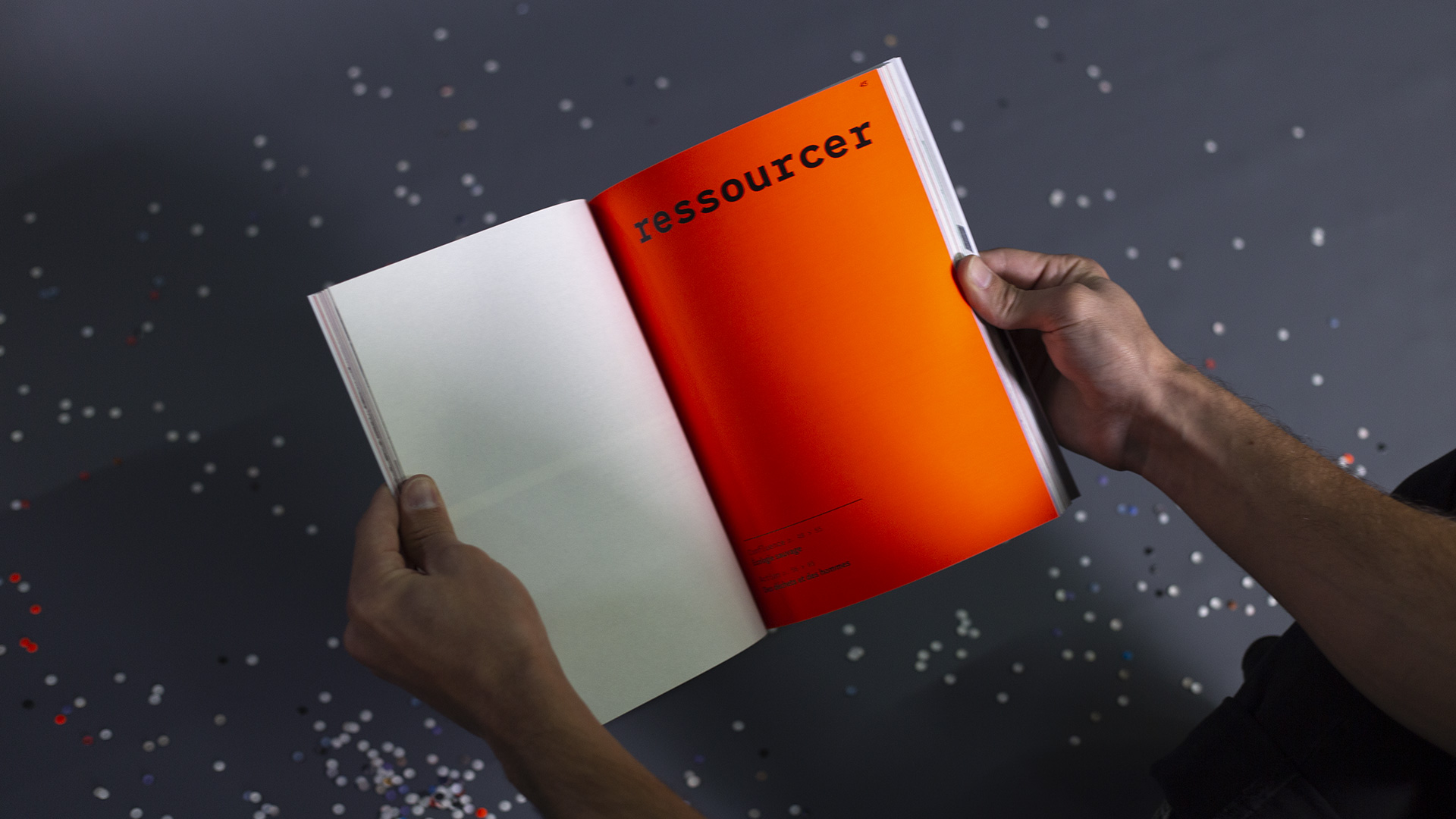
Once the texts were written, everything remained to be done. The editorial direction was intended to reflect the agency’s image: a living and sensitive corpus. The summary of this book, therefore, offers four types of content: confluence (open discussion around a given book), coming and going (story of a visit that opens up possibilities and practices), action (return to an emblematic mission of the territory), face to face (meeting and discussion with an actor in the field). Each territory and each article were then illustrated by the members of each team to show the different graphic writings available in the agency: watercolor, data graphics, drawing, painting, photography, photomontage …
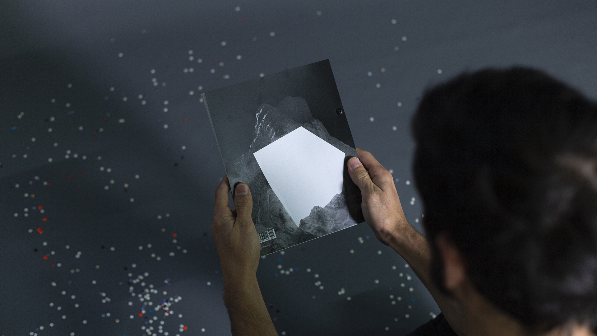
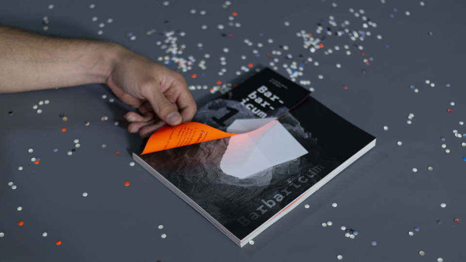
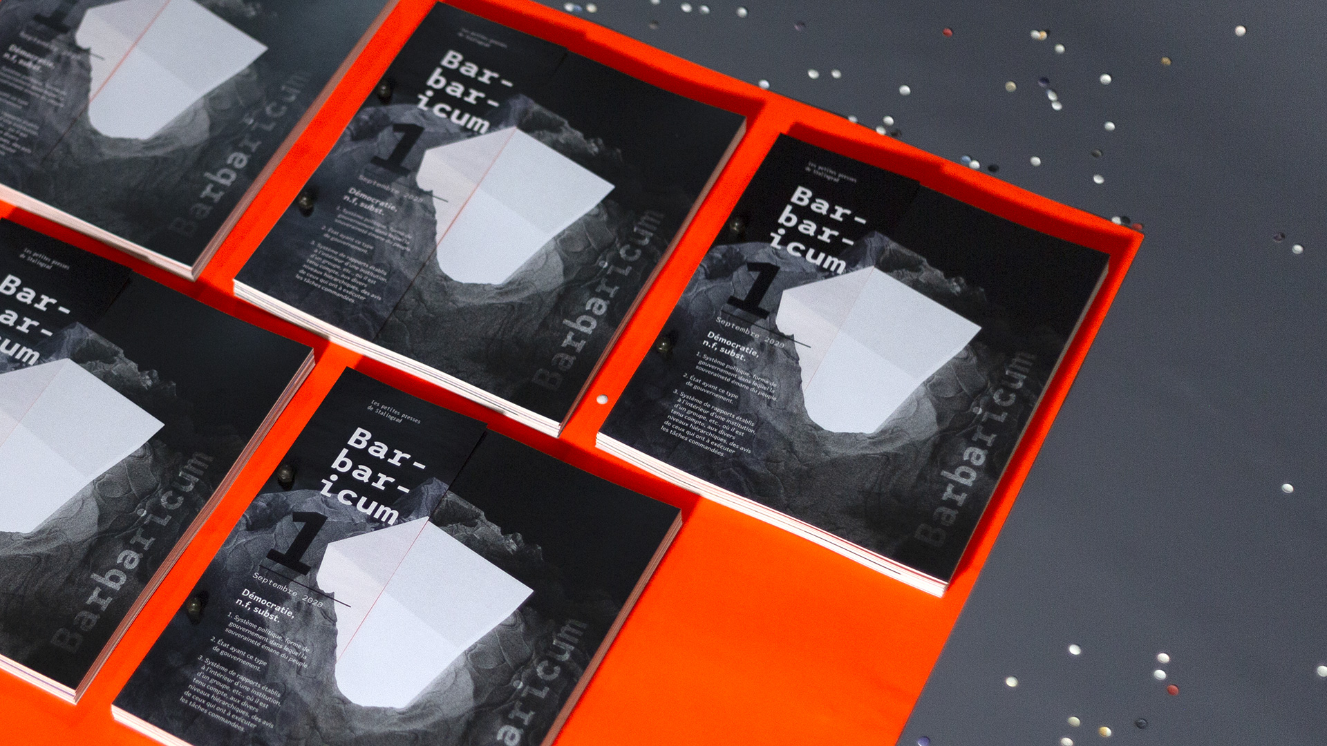
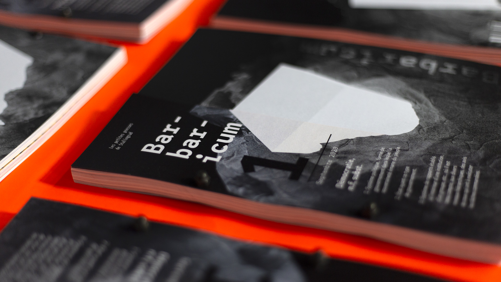
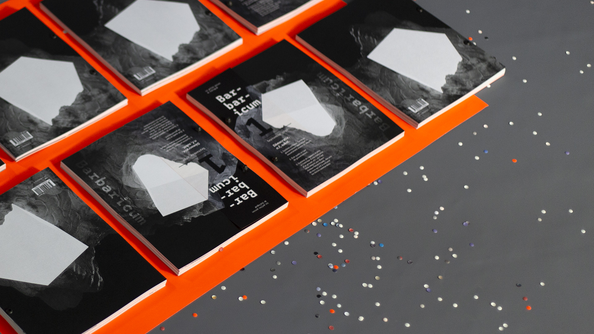
The front cover, produced on C4D, offers a visual metaphor of democracy enlightening our territories.
The layout of this annual review is done using Quebec typography and League Mono, in order to rank everyone’s comments and offer a different reading according to the interests of the readers.
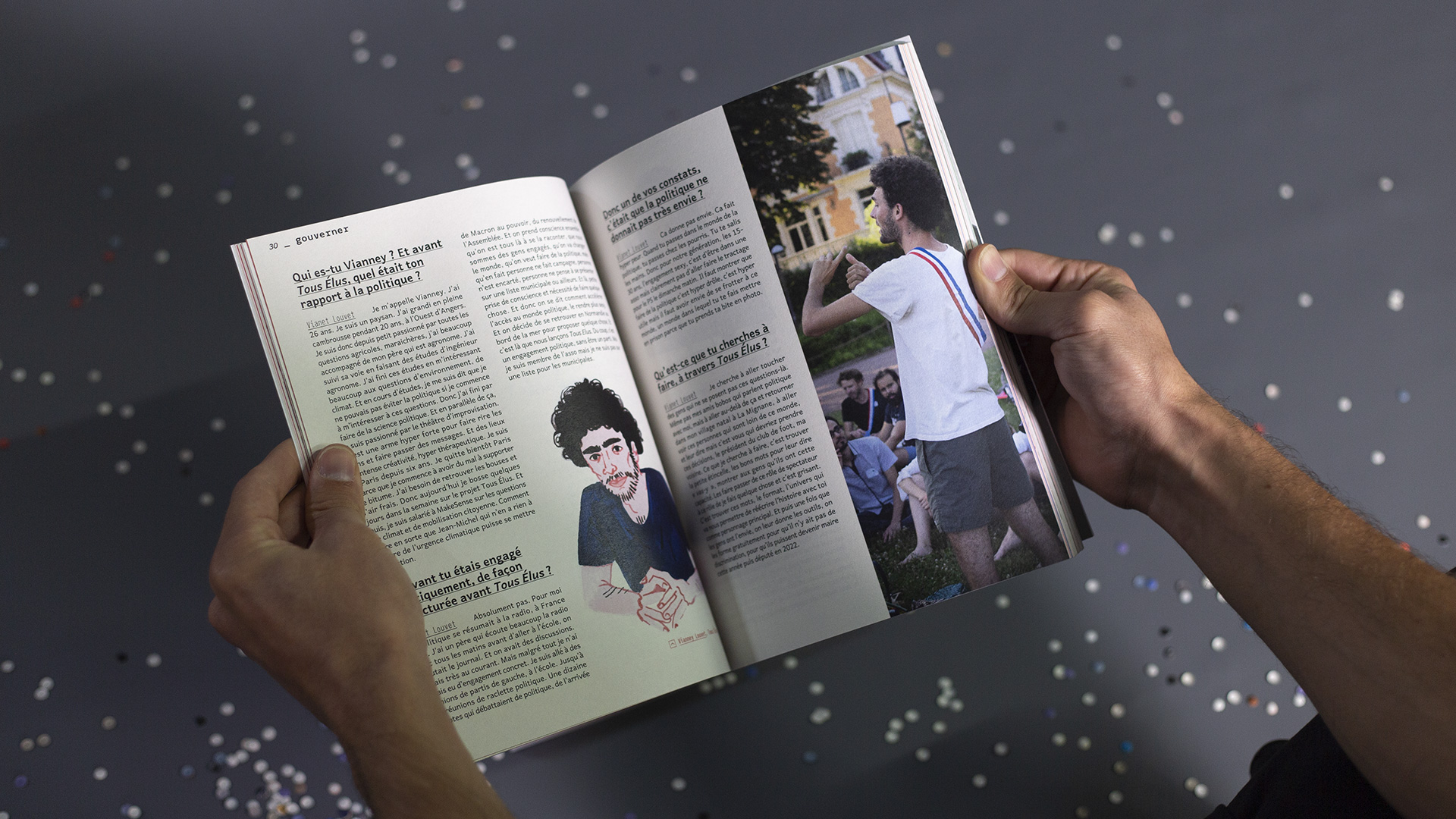
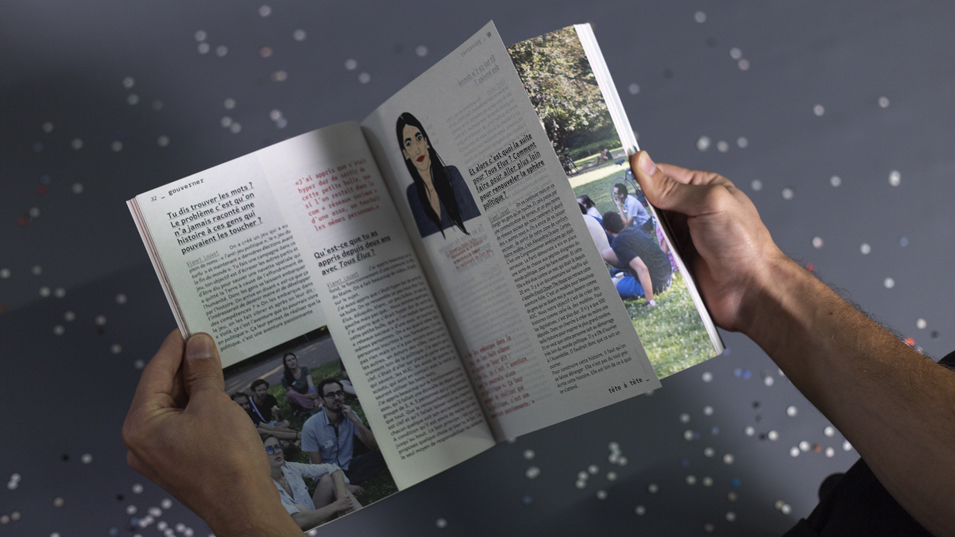
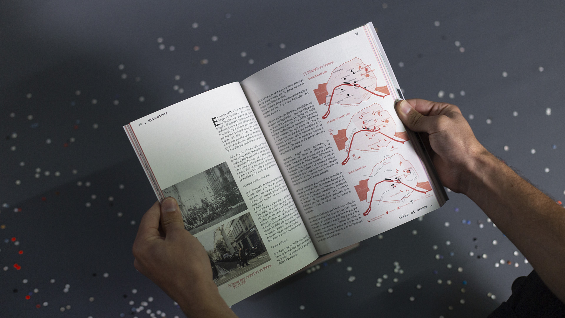
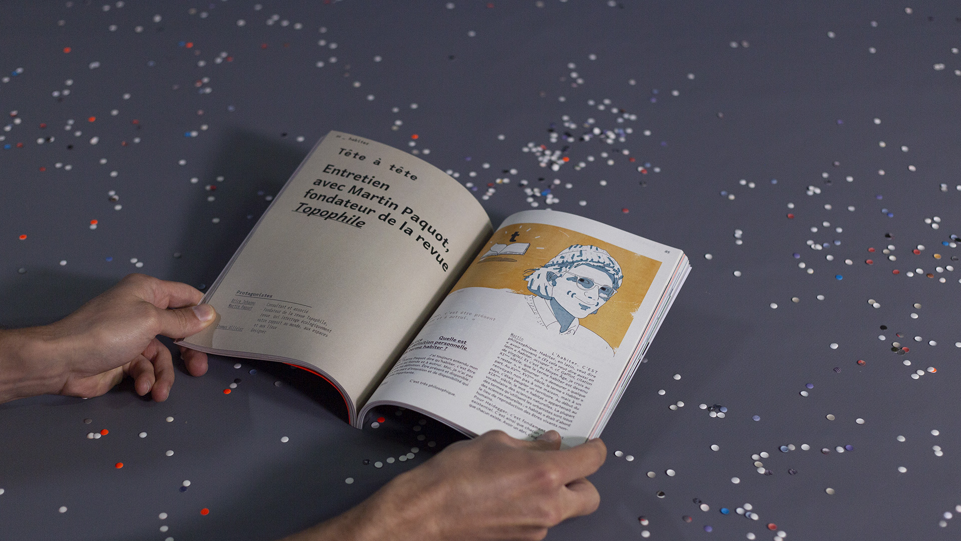
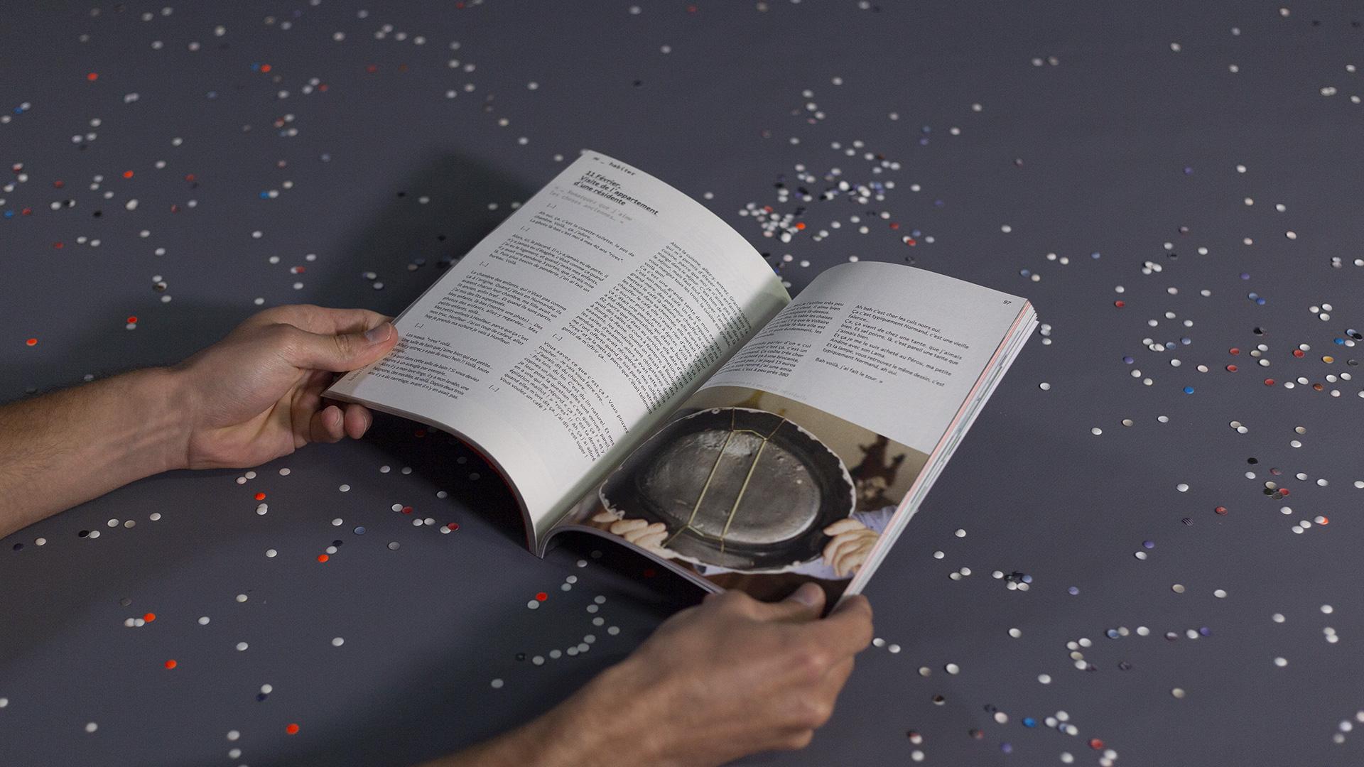
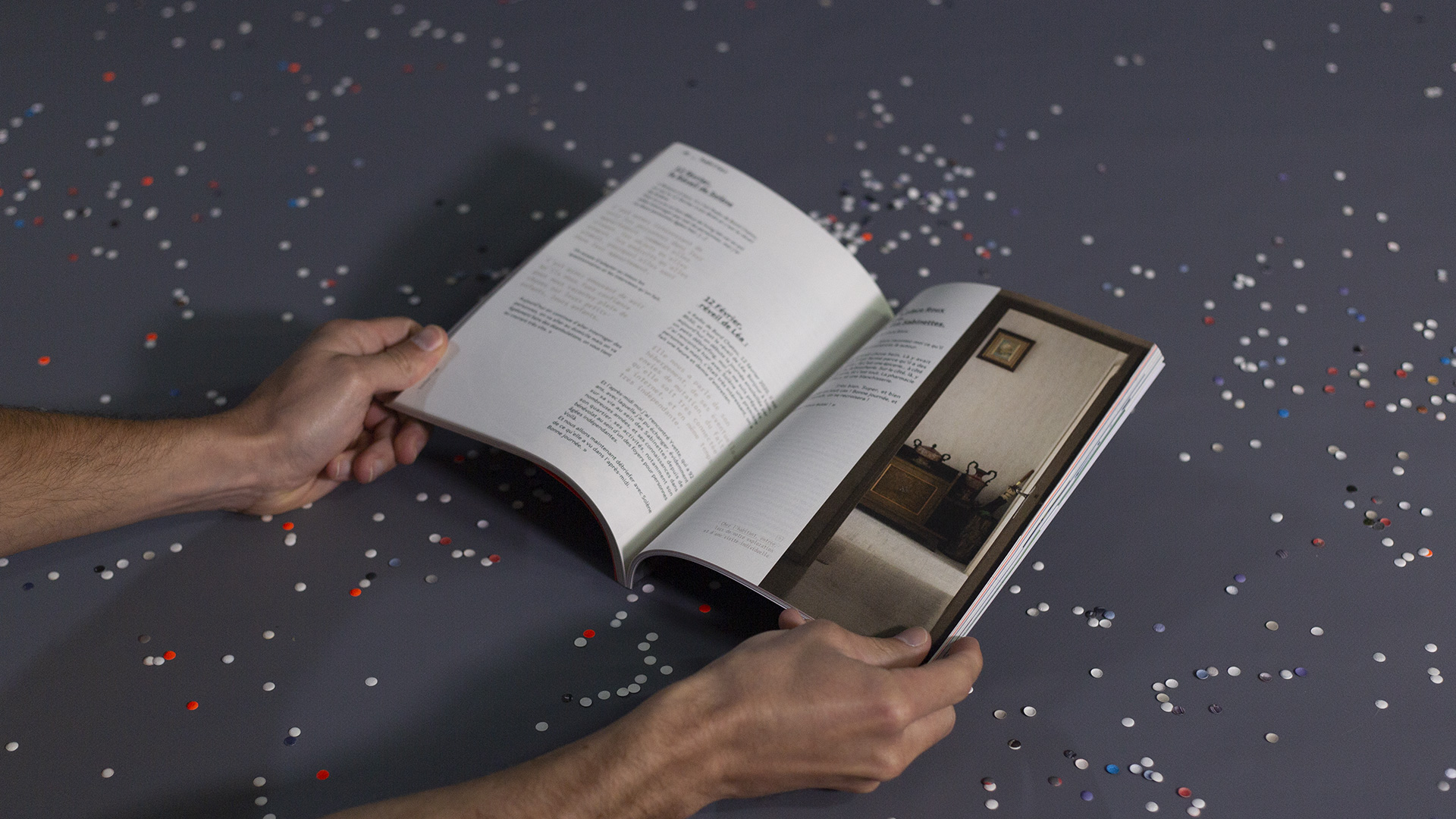
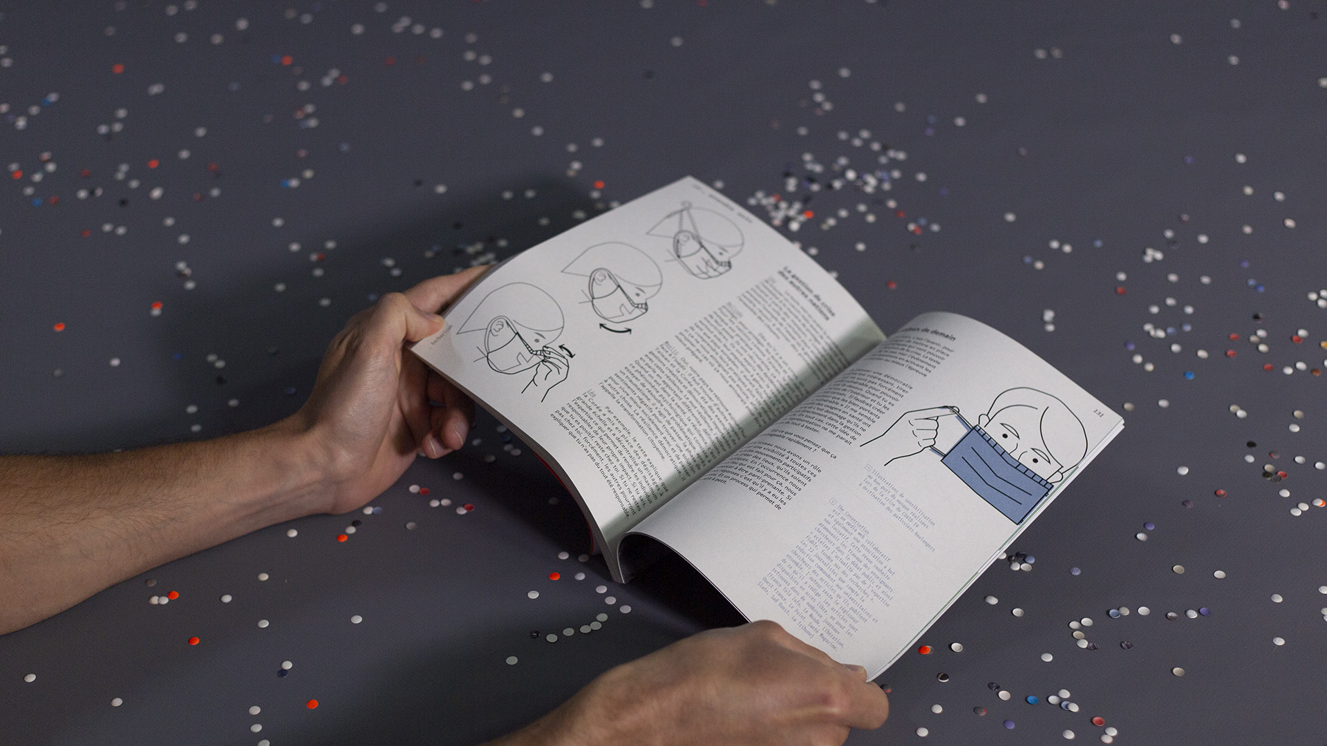
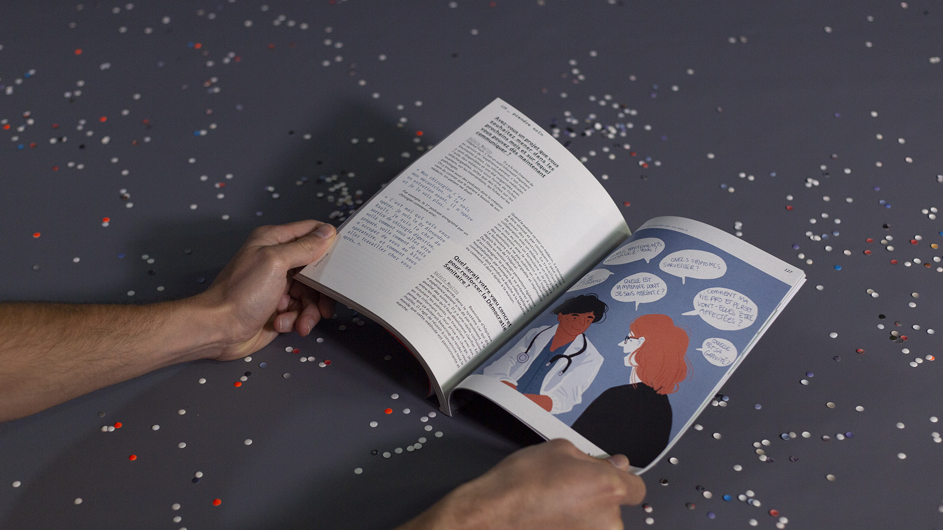
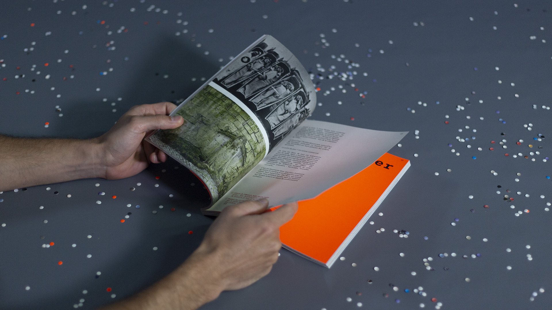
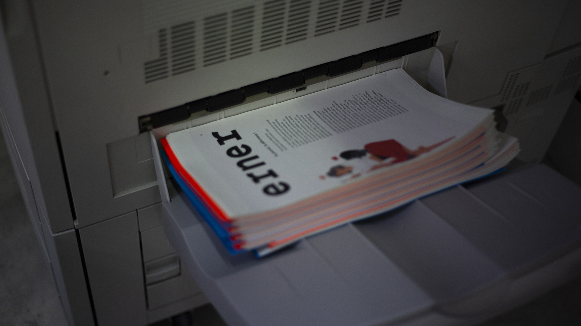
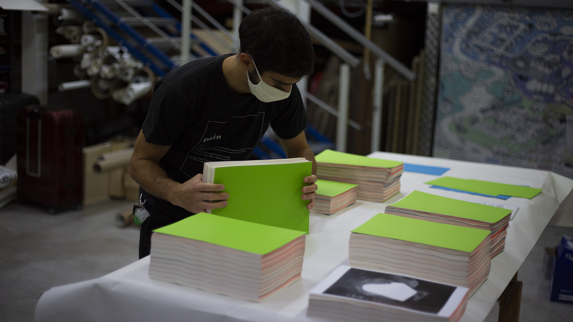
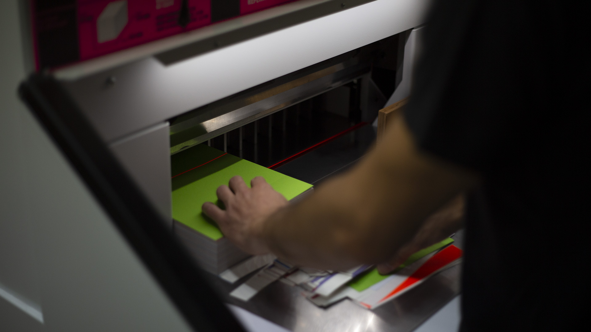
The binding, for its part, had to be simple (but original) in order to be able to control the overall production cycle of the book. Thus, a binding using screws and bolts were favored, reflecting the Maker soul that inhabits each person in the agency. The first edition was subsequently printed and shaped in our premises, by us, in 250 copies. We printed on cream Munken paper, which provides a sensitive texture, and on poppy fluorescent paper which highlights the passages between territories.
